Modern Web Design Trends
Most people stand with a foot in two distinct worlds.
There’s the real, physical one that our bodies inhabit. Then there’s the virtual world that exists online. To connect to the internet is to straddle the boundary between them.
And connect we do! The World Wide Web now has 1.77 billion websites on it, catering to every taste, interest, and persuasion under the sun. Be it for work, leisure, or boredom’s sake, most of us now spend the majority of our time connected to one website or another.
It’s no surprise, then, that having a modern website design is now essential to the entirely separate world of business! With peoples’ attention online, it’s vital for businesses to have a presence there as well.
Websites allow you to connect with your audience, capture their attention, and catalyze interest in your brand. But only when they satisfy certain web design criteria.
Want to learn more about the essential design features of high-performing websites? Read on to discover 12 modern web design trends that deliver maximal results online.
Table of Contents
1. Time Is of the Essence
Speed is one attribute that all high-performing websites have in common.
Why?
Because it’s fundamental to the user experience (UX). And a great UX, in turn, facilitates everything from higher rankings on SERPs to heightened customer satisfaction and brand image.
Basically, nobody wants to spend time on a slow-loading site. People are impatient, which makes it frustrating when you have to wait for the information you’re trying to find. With (literally) millions of other search results, it’s all too tempting to click back and look elsewhere.
More often than not, that’s exactly what happens. Your bounce rate will spike and you lose out on potential leads who clicked through to your site.
Strive to speed up your website as much as possible. If you can get the pages to load within 3 seconds, then you’re onto a real winner. Anything slower than 5 seconds and you risk testing peoples’ patience.
2. Incorporate Enough White Space
Some webmasters have a tendency to fill every last inch of space on their website. They treat it like a hoarder treats their home, acquiring endless items until there’s no room left at all!
In exactly the same way, the site ends up feeling messy, claustrophobic, and disorganized. It’s hard for users to navigate around the mass of features, difficult to find the information they need, and stressful on their eyes.
Leaving sufficient levels of white space provides an antidote to the problem.
Don’t be confused by the term though.
Whitespace doesn’t have to be ‘white’ per se; the most important aspect is the space part. Your site’s background can be any color you want, just make sure there’s sufficient space between features.
It creates an open, uncluttered, and minimalistic feel that has both aesthetic and functional benefits. Users are able to understand the flow of the page and the relationship between elements on it. White space also helps establish the visual hierarchy of the site, facilitating navigation and the identification of information.
Overall, white space improves user experience! Anybody designing their site would do well to incorporate it.
3. Leverage Simplicity
One reason that white space is so helpful is that it has simplicity at its core.
It creates a stripped-back aesthetic that makes the site both look and perform better. There’s less distraction, which leads to greater ease and enjoyment all-around.
In other words, less is more! Let that heuristic guide your on-site decision-making and you’ll thank yourself in the future. Try to embrace simplicity at every turn on your website.
Aim for clarity over complexity, ease over effort, and space over clutter.
For instance, you should make the website as easy to navigate as possible. Remove all unnecessary form fields to make web forms simple to complete. Write your content in short, snappy, and concise sentences; avoid complicated words and awkward phrasing.
Your website will become a joy to interact with, which will inevitably lead users to spend longer on it. Your rate of conversion will increase in the process.
4. Choose the Right Font
The typography on your website can make or break its success with users.
It seems so simple! Many people assume, incorrectly, that the appearance of their headings and copy makes no difference. Too many webmasters pick a font that’s off-brand, unattractive, and, in worst-case scenarios, illegible.
In reality, typography is one of the most important decisions you’ll make for your website.
The primary factor to consider is readability. All text should be easy to read on every device. It should stand out from the background, be large enough to read without straining, and be styled in line with your overall aesthetic.
5. Think Carefully About Color
Color schemes for websites are key.
Get it right and you cultivate attractive, on-brand webpages that elicit pleasurable emotional reactions in users. The web copy is easy to read and any images/features draw the eye.
Get it wrong, though, and the exact opposite happens; the website (and your business) suffers at every level. Everything from the aesthetics to the UX fails to impress.
Know that there’s no definitive color-scheme that’ll work for everybody. Different sites benefit from different colors in relation to their unique brand image and target audience.
However, there are definite trends to keep in mind.
For example, modern websites tend to use muted pallets with an emphasis on gradients; lighter background colors are often favored over dark ones.
Struggling to decide the right pallet for your site? Consider looking into the psychology of color to find a scheme that matches the emotional response you’re hoping to elicit.
6. Include Grids and Patterns
Consider playing around with specific visual features such as patterns and grid designs.
Let’s start with the grids.
Modern web designers in web design agency have started using asymmetric grid layouts to create unique, minimalist, and sleek displays. By incorporating white space amongst well-positioned geometric shapes, users are drawn to particular elements on the page.
Patterns provide an alternative to solid blocks of color on your website, adding a satisfying sense of texture to the screen. Whether you use them to highlight certain areas or to cover entire sections of the screen, patterns make an attractive visual element to any website.
7. Use Lots of High-Quality Images
As the old saying goes:
‘A picture says a thousand words’.
It also breaks up the text on your webpages, cultivates your brand image, and improves the aesthetic appeal of your site! Overall, including high-quality photography on your website works a treat.
The minimal attention span of users comes into play here as well.
Essentially, anybody that clicks through to a website and finds a giant wall of text is unlikely to read it! They’d have to cipher through everything to find the information they wanted. Needless to say, most people lack the time or inclination to put it in that kind of effort.
Images help break it up into more manageable chunks. The text becomes easier to scan, which is good news as far as the user’s concerned.
Try to avoid generic and uninteresting stock photography though. High-quality images that are both on-brand and in-keeping with the overall design are best. It creates a more professional and authentic vibe that will help cultivate trust with users.
8. Focus on the Fold
Imagine that you’re searching for something on Google. As always, you find a particular URL of interest, click on it, and land on the page.
The ‘fold’ is the bottom border of the page that opens. In other words, you have to scroll down in order to see anything more (this content is what’s known as ‘below the fold’).
As you can imagine, everything ‘above the fold’ is vital to a webmaster’s goals. After all, this is what a user sees when they land on your page. It forms their first impression and convinces them to either look further or click back.
Imagine somebody trying to sell their house. They’ll mow the lawn, paint their front door, and do anything they can to boost the curb appeal of the property.
Why? Because it’s the first thing people see! A quality visage builds interest and makes it more attractive to would-be buyers.
The same goes for everything above the fold on your website. Be sure to put your calls to action, headlines, and best content where users can see them straight-away.
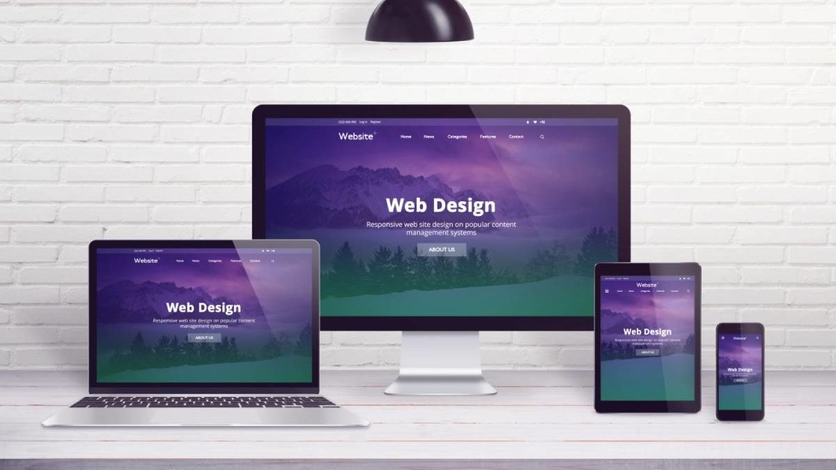
9. Make Sure It Works on All Devices
Gone are the days when people only ever accessed the internet on their desktop computer.
You’ve now got tablet, mobiles, and PCs from which to surf the web. In other words, people visit websites from a number of different places.
Imagine having a website that only worked properly on one of them! You’d only have access to a section of the potential market- shooting yourself in the foot in terms of traffic.
That’s why it’s vital to optimize your site for all devices. It should open and operate just as effectively, regardless of how it’s being viewed.
Mobile optimization should be your priority though. Indeed, the majority of web traffic now comes via smartphones. People walk around with mini-computers in their pockets, surfing the web and accessing information on the go.
That’s why Google now prioritizes mobile content in search results. If your site isn’t compatible with smartphones, then you’ll struggle to rank as high as your competitors. Needless to say, that’s the last thing you need when running a business.
10. Use 3D Visuals
Users will always prefer visually appealing websites.
It’s your job to create a site that looks just as good as it functions! Web designs that incorporate 3D visual displays are one of the best ways to do it.
Now, this is nothing new. Designers have long known the preference people have for 3 dimensions. However, it’s only recently that the tech required to make it happen has become cheaper and more readily available.
3D displays create immersive website experiences that draw you into the screen. They’re attention-grabbing, atmospheric, and interactive. The UX improves, people spend longer on the site, and they’ll rate your brand more favorably too.
11. Incorporate Graphics
Modern web designs have started combining photography with graphics to great effect too.
Once again, it’s a way to boost the aesthetics of a website. Mixing illustrations and photos together creates endless opportunities for personalization.
It’s like a chef adding multiple spices to their cooking instead of one. The dish benefits from a new and unique depth of flavor that would otherwise have been unattainable.
Using graphics and photography in tandem means you can add a playful and energetic spin to what might otherwise seem too ordinary. You can play around, get creative, and put something together that’s unique among your competition.
All told, it’s a mighty boon in terms of branding.
12. Incorporate Dynamic Scrolling
Increasing numbers of modern websites are starting to use dynamic scrolling.
Otherwise known as ‘parallax scrolling’, it’s another clever way to draw users into your content.
Basically, scrolling down on a webpage causes elements in the foreground to move faster than those in the background. You end up with an engaging 3D experience as you browse the site.
That’s not the only way to use it. Some sites employ dynamic scrolling to play a video or trigger an animation when people scroll. The website becomes memorable, fun, and more attention-grabbing in the process.
Just be just to use it sparingly! In excess, dynamic scrolling can be distracting and make navigating the site navigation more of a challenge.
Time to Create a Modern Website
It’s more important than ever before for a business to have an online presence.
After all, billions of eyes are staring at screens for hours every day! Without a website, it’s far harder to put your products/services in front of them. Everything from the leads to the sales that you’re able to generate takes a hit.
Hopefully, the modern website design tips in this post will help you create the best site possible for your business. Search ‘web design’ on our website to read more articles like this one!