
If you’ve ever browsed Korean or Japanese websites, you’ve probably noticed something… different.
Not just visually. But how they feel.
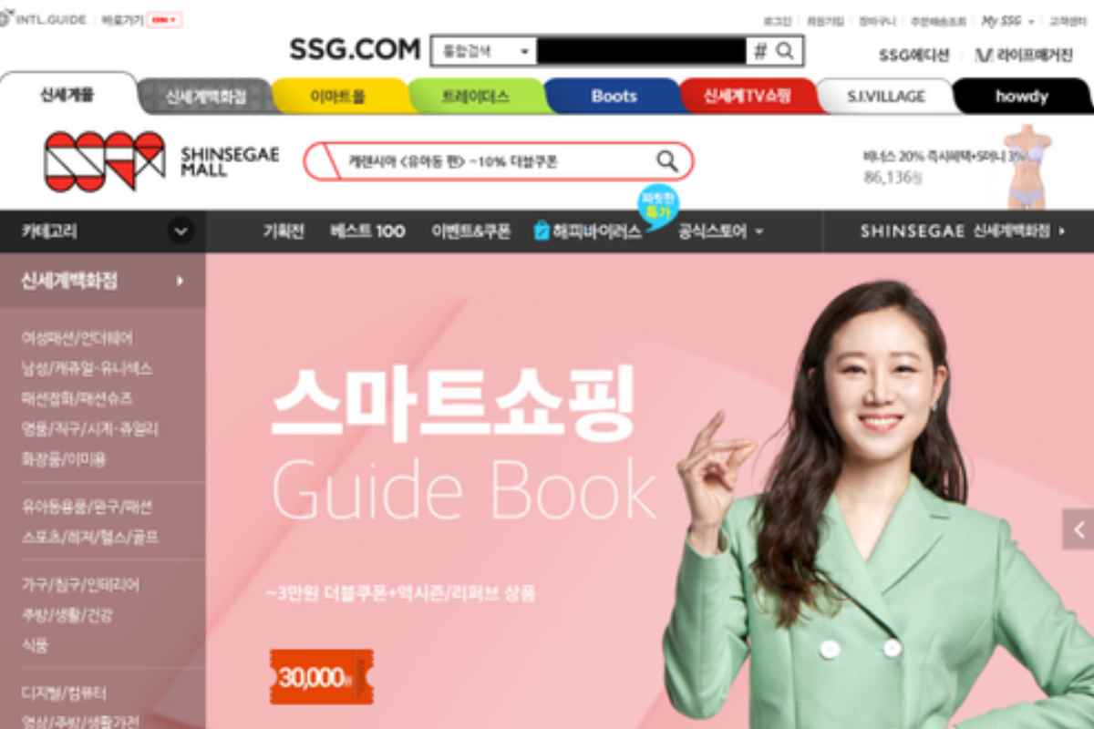
Some Korean sites feel almost like interactive apps—smooth, animated, dynamic.
Meanwhile, many Japanese websites? Dense. Information-heavy. But weirdly efficient once you get used to them.
And here’s the thing: none of this is random.
There’s a system behind it. Culture, tech, user behavior—all mixed together.
Table of Contents
Why Korea and Japan Feel So Different in UI/UX
Look, UI/UX isn’t just design. It’s behavior translated into pixels.
In Korea:
Users expect speed + visual polish
High tolerance for motion and animation
Strong mobile-first habits
In Japan:
Users value information depth over minimalism
There‘s nothing easy about building trust…, it is a matter of giving details.
Navigation types tend to be more focused on usability rather than looks.
When you‘re designing for these markets you‘re not just changing layouts.
You’re changing thinking models.
Core UI/UX Features (What Still Holds True)
1. Simplicity (But Interpreted Differently)
Here’s where people get confused.
Both regions value simplicity—but define it differently.
Korean design → clean, visual minimalism
Japanese design → structured complexity (organized, not cluttered)
Korean sites:
lots of whitespace
bold visuals
fewer distractions
Japanese sites:
more text
tighter layouts
information-first approach
And honestly? Both work. Just for different audiences.
2. Localization (This Is Non-Negotiable)
You can’t copy-paste design across cultures. It doesn’t work.
In Korea and Japan, localization goes beyond language:
icon styles
color meaning
reading patterns
even button placement
Example:
A CTA that works in the US might feel too aggressive in Japan.
Subtle changes matter.
A lot.
3. Interactive Elements (Where Korea Stands Out)
Korean websites love interaction.
We’re talking:
smooth transitions
micro-animations
scroll-based effects
And not just for looks—it’s engagement.
Users expect responsiveness. Movement. Feedback.
Japanese sites? More restrained.
Interaction exists, but it’s usually:
functional
subtle
not flashy
4. Mobile-First (Not Optional Anymore)
Both countries are heavily mobile-driven.
But Korea takes it to another level.
Design usually starts with:
→ mobile
→ then scales up
Not the other way around.
Which is why:
navigation is thumb-friendly
loading is optimized
layouts adapt seamlessly
Technical Analysis: What Developers Should Actually Care About
Alright, now the real stuff.
Because “clean design” doesn’t mean anything without performance.
Korean Websites: High Interaction, High Power
Korean platforms often use:
WebGL for advanced graphics
Three.js for 3D experiences
heavy animation layers
You’ll see:
interactive product pages
motion-heavy landing pages
immersive storytelling layouts
But here’s the trade-off:
👉 heavier load times if not optimized properly
Top Korean e-commerce platforms still aim for:
LCP (Largest Contentful Paint): ~2.5 seconds or less
CLS (Cumulative Layout Shift): under 0.1
Not easy with heavy visuals—but achievable with good engineering.
Japanese Websites: Lightweight and Efficient
Japan takes a different route.
Instead of heavy rendering:
SVG animations
lightweight transitions
minimal JS dependency
Focus is on:
speed
stability
reliability
Typical performance targets:
faster initial load
lower script execution time
consistent layout behavior
Less flashy. More dependable.
Frameworks and Development Preferences
Let’s talk stack.
In Korea
Developers often lean toward:
React / Next.js
advanced front-end animation libraries
component-driven design systems
Why?
Because they support:
dynamic UI
fast iteration
rich interactions
In Japan
You’ll often see:
more traditional frameworks
server-rendered architectures
lighter front-end layers
Why?
Because:
stability > experimentation
performance consistency matters more than visual complexity
Choosing a UI/UX Design Company (What Actually Matters)
Let’s cut the generic advice. Here’s what you should really check.
Portfolio (But Look Deeper)
Don’t just look at visuals.
Check:
load speed
responsiveness
interaction smoothness
A pretty design that lags? Useless.
Client-Centric Approach (Real One, Not Buzzword)
Honestly, everyone says they’re client-focused.
But ask:
do they run usability tests?
do they validate user behavior?
If not, it’s guesswork.
Innovation vs Practicality
Flashy isn’t always better.
You want a team that knows:
when to push boundaries
when to keep it simple
Balance matters.
Communication (Underrated but Critical)
Bad communication ruins good design.
You want:
regular updates
clear timelines
honest feedback loops
Otherwise? Delays. Frustration.
Reviews and Testimonials
Not just ratings.
Read actual feedback.
Look for:
missed deadlines
support issues
post-launch performance
That’s where the truth is.
The Real Takeaway
Here’s the thing.
Korean design pushes boundaries—visual, interactive, bold.
Japanese design focuses on clarity—structured, detailed, reliable.
Neither is “better.”
They’re optimized for different users.
And if you’re building for either market, you can’t fake it.
You have to understand:
how people browse
what they trust
what they expect
Because good UI/UX isn’t about trends.
It’s about alignment.
Particularly in countries like Korea and Japan, where technology and design merge seamlessly, bespoke UI/UX designs contribute significantly to the success of websites.
Conclusion
If you take one thing from this, let it be this:
Don’t copy design.
Understand users.
That’s the difference between something that looks good…
and something that actually works.